Practical Decluttering of Matplotlib Visuals
These notes illustrate the practical steps required to adhere to Tufte’s recommendations regarding Data-Ink Ratio and Chart Junk.
Specifically:
- Begin with a default bar chart.
- Remove ticks and y-axis labels.
- Remove the frame.
- Change the bar colors to be higher contrast and to highlight the Python bar.
- Add direct labels for the y-axis values.
%matplotlib inline

import matplotlib.pyplot as plt
import numpy as np
The following steps improve the appearance of the inline figures.
- First, it changes the dpi to be a higher-quality image. Changing the DPI has the effect of increasing the size of the figures.
- Second, it configures the
inlinebacked to work with high pixel density displays.
import matplotlib as mpl
mpl.rcParams['figure.dpi']= 150
%config InlineBackend.figure_format = 'retina'
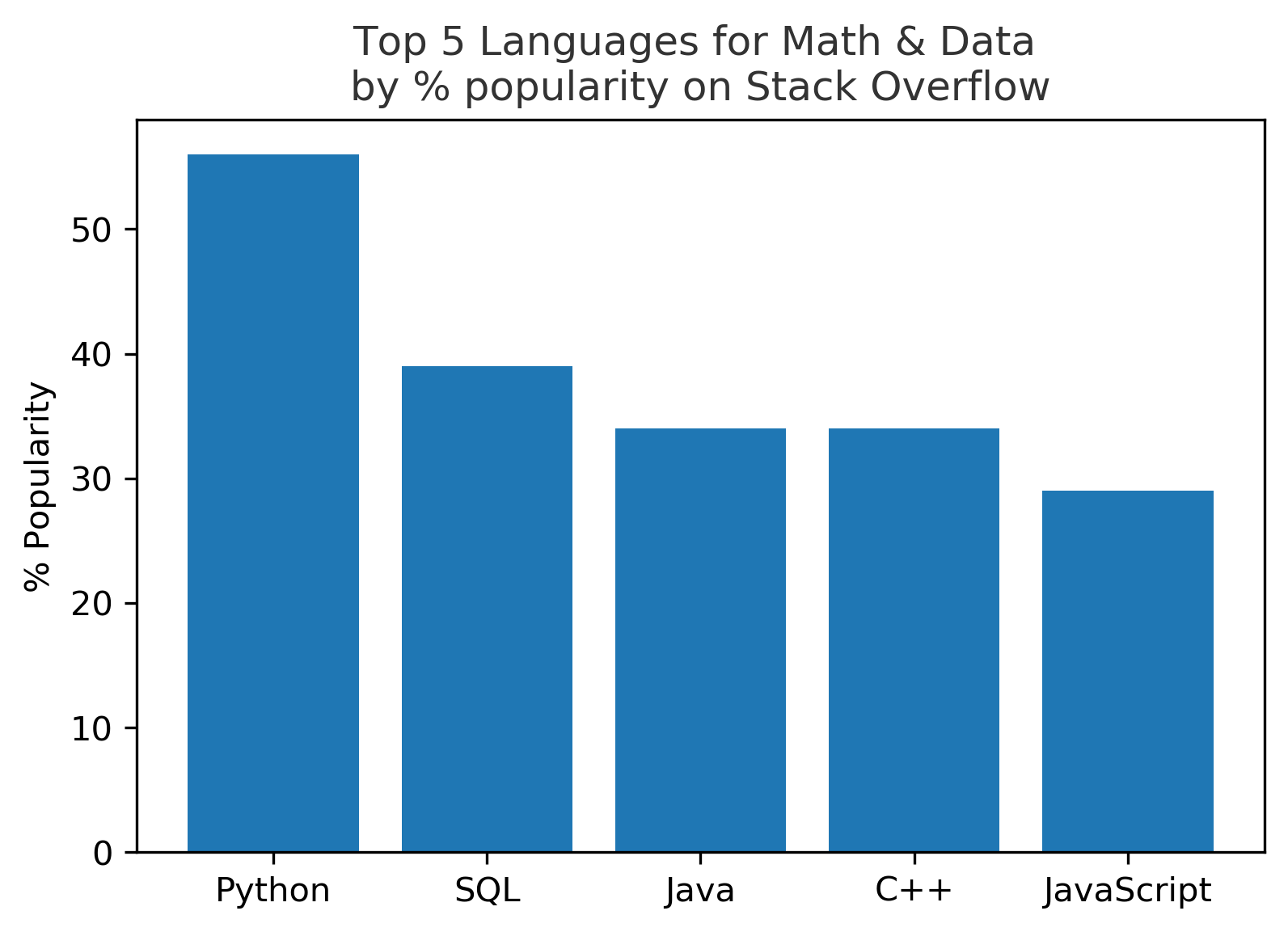
A default Matplotlib bar chart visual is shown below.
languages =['Python', 'SQL', 'Java', 'C++', 'JavaScript']
pos = np.arange(len(languages))
popularity = [56, 39, 34, 34, 29]
def setup_original():
    barlist = plt.bar(pos, popularity, align='center')
    plt.xticks(pos, languages)
    plt.ylabel('% Popularity')
    plt.title('Top 5 Languages for Math & Data \nby % popularity on Stack Overflow', alpha=0.8)

    return barlist
plt.figure()
setup_original();
This figure can be improved by removing the tick marks from both axes and the labels from the y-axis.
def remove_ticks_and_labels():
    plt.tick_params(
        axis='x',
        bottom=False)
    plt.tick_params(
        axis='y',
        left=False,
        labelleft=False)
plt.figure()
setup_original()
remove_ticks_and_labels()
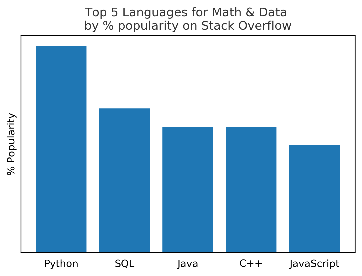
The figure can be further improved by removing the border.
def remove_frame():
    for spine in plt.gca().spines.values():
        spine.set_visible(False)
plt.figure()
setup_original()
remove_ticks_and_labels()
remove_frame()
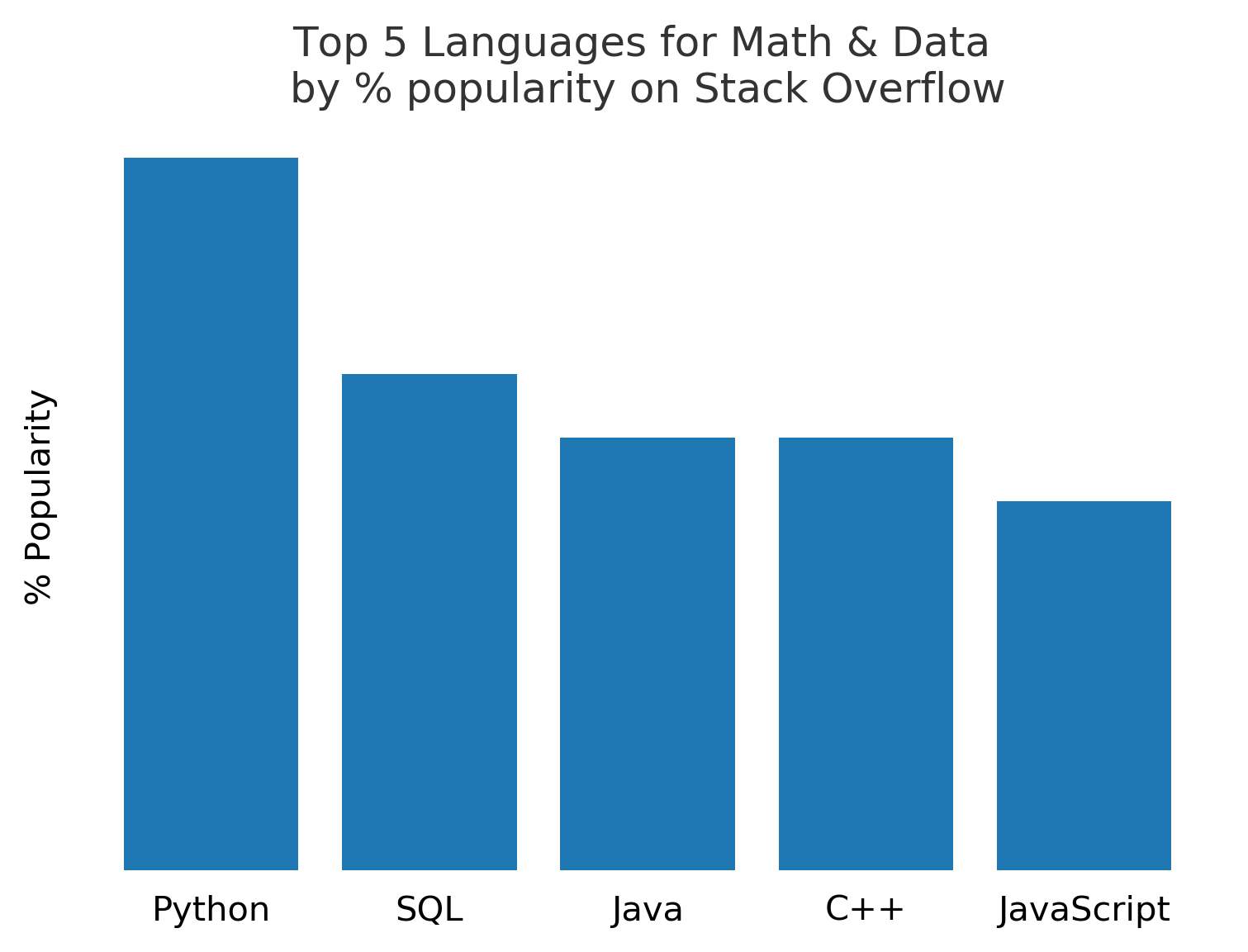
Change the bar colors to be more neutral and to highlight the Python bar.
def change_bar_colors(barlist):
    for bar in barlist:
        bar.set_color('grey')
    barlist[0].set_color('navy')
plt.figure()
barlist = setup_original()
remove_ticks_and_labels()
remove_frame()
change_bar_colors(barlist)

Change the labels to appear softer by using a grey color.
def change_label_color():
    plt.gca().get_yaxis().get_label().set_alpha(0.8)
    [i.set_alpha(0.8) for i in plt.gca().get_xticklabels()]
    plt.gca().set_title(plt.gca().get_title(),
                        alpha=0.8)
plt.figure()
barlist = setup_original()
remove_ticks_and_labels()
remove_frame()
change_bar_colors(barlist)
change_label_color()

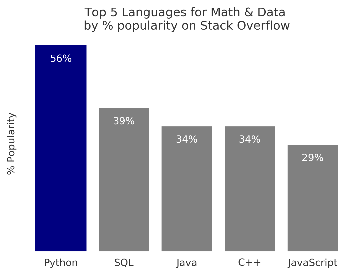
Add direct labels to the bars.
def add_direct_labels():
    rects = plt.gca().patches

    for rect, label in zip(rects, popularity):
        height = rect.get_height()
        plt.gca().text(rect.get_x() + rect.get_width() / 2,
                       height - 5,
                       str(label)+'%',
                       ha='center',
                       va='bottom',
                       color='white')
plt.figure()
barlist = setup_original()
remove_ticks_and_labels()
remove_frame()
change_bar_colors(barlist)
change_label_color()
add_direct_labels()

A single script to produce this visual from scratch, without the iterative improvements, is shown below.
languages =['Python', 'SQL', 'Java', 'C++', 'JavaScript']
pos = np.arange(len(languages))
popularity = [56, 39, 34, 34, 29]

barlist = plt.bar(pos,
                  popularity,
                  align='center',
                  color='grey')
barlist[0].set_color('navy')

plt.xticks(pos,
           languages,
           alpha=0.8)
plt.ylabel('% Popularity',
           alpha=0.8)
plt.title('Top 5 Languages for Math & Data \nby % popularity on Stack Overflow',
          alpha=0.8)

plt.tick_params(
    axis='x',
    bottom=False)
plt.tick_params(
    axis='y',
    left=False,
    labelleft=False)

for spine in plt.gca().spines.values():
    spine.set_visible(False)

rects = plt.gca().patches
for rect, label in zip(rects, popularity):
    height = rect.get_height()
    plt.gca().text(rect.get_x() + rect.get_width() / 2,
                   height - 5,
                   str(label)+'%',
                   ha='center',
                   va='bottom',
                   color='white')
These notes were taken from the Coursera course Applied Plotting, Charting & Data Representation in Python. The information is presented by Christopher Brooks, PhD, a Research Assistant Professor at the University of Michigan.