Heat Maps
Heat maps are a way of visualizing three-dimensional data while taking advantage of the 2-dimensional spacing of the phenomena.
Certain data lends itself very well to headmaps, such as weather and other data spread across a geographic region. The location is given by two dimensions, latitude and longitude, and a third dimension is overlaid on top of those using color to indicate its intensity.
Probabilities can also be overlaid, such as in the example below. This image shows the probability of where Malaysian Airlines 370 crashed.
%%html
<img src='MH370_location_probability_heat_map_per_DST_Group_analysis.jpg' />
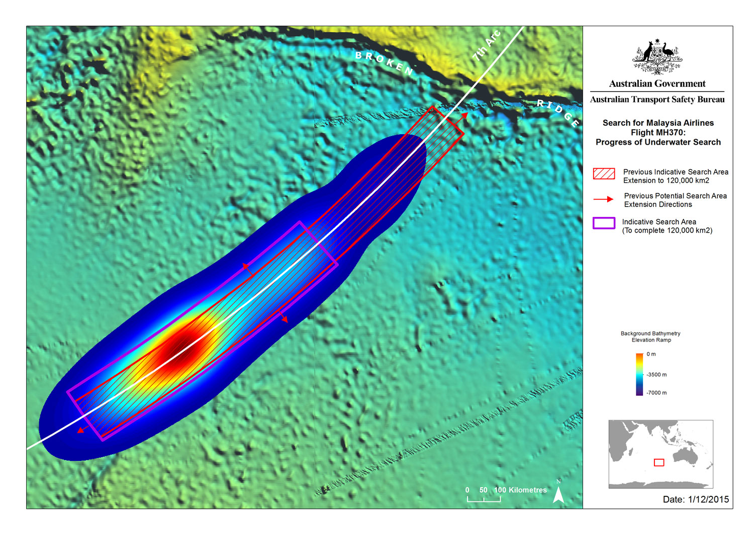
By Australian Transport Safety Bureau, CC BY 3.0 au, https://commons.wikimedia.org/w/index.php?curid=45392853
Heat maps are only appropriate where there are continuous relationships between dimensions. Again, this is specifically true for geographic data. Using a heat map to show categorical data, for example, is wrong. It is misleading to the viewer, who will try try to look for patterns through spatial proximity.
In matplotlib, a heat map is just a two-dimensional histogram where the x and y values indicate potential points and the color plotted is a function of the frequency of the observation.
First, I will regenerate the data used for the histogram plots.
import numpy as np

Y = np.random.normal(loc=0.0,
                     scale=1.0,
                     size=10000)
X = np.random.random(size=10000)
print(X[:5])
print(Y[:5])
[0.89192972 0.97802799 0.65460936 0.39604417 0.59191634]
[-0.16219239 -0.45980713 -0.72273223  2.19554823  1.38833726]
Now, plot it using the gridspec function.
%matplotlib notebook

import matplotlib.pyplot as plt
import matplotlib.gridspec as gridspec

plt.figure()
gspec = gridspec.GridSpec(3, 3)

top_histogram = plt.subplot(gspec[0, 1:])
side_histogram = plt.subplot(gspec[1:, 0])
lower_right = plt.subplot(gspec[1:, 1:])

lower_right.scatter(X, Y)
top_histogram.hist(X,
                   bins=100,
                   density=True)
s = side_histogram.hist(Y,
                        bins=100,
                        orientation='horizontal',
                        density=True)
side_histogram.invert_xaxis()

for ax in [top_histogram, lower_right]:
    ax.set_xlim(0, 1)
for ax in [side_histogram, lower_right]:
    ax.set_ylim(-5, 5)
<IPython.core.display.Javascript object>

The hist2d function is used to create heatmaps. Colorbar legends are added by calling the colorbar() function.
plt.figure()
plt.hist2d(X, Y, bins=25)
plt.colorbar();
<IPython.core.display.Javascript object>

Changing the number of bins has the expected effect.
plt.figure()
plt.hist2d(X, Y, bins=10)
plt.colorbar();
<IPython.core.display.Javascript object>

When the number of bins used becomes large, each data point begins falling into its own category.
plt.figure()
plt.hist2d(X, Y, bins=100)
plt.colorbar();
<IPython.core.display.Javascript object>

plt.figure()
plt.hist2d(X, Y, bins=250)
plt.colorbar();
<IPython.core.display.Javascript object>
