Binary Classifiers, ROC Curve, and the AUC
Summary
A binary classification system involves a system that generates ratings for each occurrence, which, by ordering them, are turned into rankings, which are then compared to a threshold. Occurrences with rankings above the threshold are declared positive, and occurrences below the threshold are declared negative.
The receiver operating characteristic (ROC) curve is a graphical plot that illustrates the diagnostic ability of the binary classification system. It is generated by plotting the true positive rate for a given classifier against the false positive rate for various thresholds. The area under the ROC curve (AUC) is an important metric in determining the effectiveness of the classifier. An AUC of 0.5 indicates a classifier that is no better than a random guess, and an AUC of 1.0 is a perfect classifier.
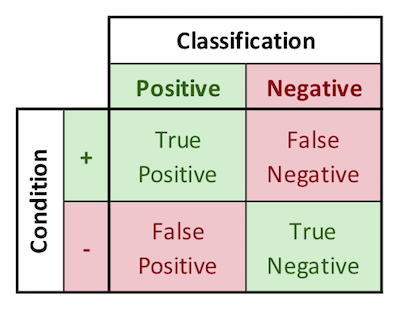
Binary classification is the process of classifying items into two different categories, Positive and Negative. 100% correct classification is rarely possible, so binary classification schemes are almost always exercises in compromise between two types of errors: “False Positives” and “False Negatives.” There are likewise two ways of being correct, namely “True Positives” and “True Negatives.” These ways of being correct and incorrect are represented graphically in 2-by-2 grids called “confusion matrices,” an example of which I’ve included below.
In the course on which this note is based, Professor Egger describes the historical events that led to the development of a methodology for evaluating binary classification schemes. During WW2, Great Britain’s newly invented radar systems were able to detect German bombers, but could also detect innocuous objects like flocks of seagulls. The cost of a false positive was the wasting of precious aviation fuel to scramble British aircraft to intercept seagulls that had been mistaken as bombers. The cost of a false negative was allowing German bombers to drop bombs on London, uncontested. It was therefore not viable to simply respond to every blip on the radar screen, but also not possible to simply not respond at all. It was a very high stakes situation that demanded methodical binary classification.
To evaluate the decision criteria for when to scramble British fighters, an (as yet unnamed) statistical genius developed the technique of maximizing the area under the receiver operating characteristic (ROC) curve. This methodology allowed decision makers to strike an optimal balance between false negatives and false positives, based upon the relative “costs” of each. It is so effective that it is still in use today. To discuss the ROC methodology in more depth, the following image introduces Professor Daniel Egger’s lettering system overlaid on the confusion matrix. The interpretation of the letters are shown below. Other probability distributions, conditional probabilities, and general rules are also defined below.
Confusion Matrix Terms
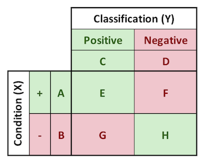
A: p(+), incidence of + condition
B: p(-), incidence of - condition
C: p(test POS), incidence of POS classification
D: p(test NEG), incidence of NEG classification
E: p(test POS, +), true positives
F: p(test NEG, +), false negatives
G: p(test POS, -), false positives
H: p(test NEG, -), true negatives
Note the distinction between the true positives, true positive rate, and positive predictive value:
$$true\ positive\ count\ = p(test\ POS,\ +) = E$$
$$true\ positive\ rate\ = p(test\ POS\ | +) \ = \frac{E}{A}$$
$$positive\ predictive\ value\ = p(+ | test\ POS) \ = \frac{E}{C}$$
Probability Distributions
| Notation | Name | Formula |
|---|---|---|
| p(X) | Marginal Probability of the Condition | p(A,B) |
| p(Y) | Marginal Probability of the Condition | p(C,D) |
| p(X,Y) | Joint Distribution of X and Y | p(E,F,G,H) |
| p(X)p(Y) | Product Distribution of X and Y | p(AC,AD,BC,BD) |
Conditional Probabilities
| Notation | Name | Formula |
|---|---|---|
| p(Test POS | + ) | True Positive Rate | E / A |
| p(Test NEG | + ) | False Negative Rate | F / A |
| p(Test POS | - ) | False Positive Rate | G / B |
| p(Test NEG | - ) | True Negative Rate | H / B |
| p( + | Test POS) | Positive Predictive Value (PPV) | E / C |
| p( - | Test POS) | 1 - PPV | G / C |
| p( + | Test NEG) | 1 - NPV | F / D |
| p( - | Test NEG) | Negative Predictive Value (NPV) | H / D |
Other Rules
- A + B = 1
- C + D = 1
- E + F + G + H = 1
- E + F = A
- G + H = B
- E + G = C
- F + H = D
Bombers and Seagulls Example

Using as our example the radar, bomber, and seagull situation, every radar blip is assigned a numerical value. In this situation the numerical value is based upon the size of the radar blip. The blips are then rank-ordered by decreasing size. The higher the “rating” of a given blip, the more likely it is to be a bomber. For our purposes now, we also assume that we have our data is labeled. IE, we know which ratings ended up being bombers, and which ended up being seagull flocks or thick clouds.
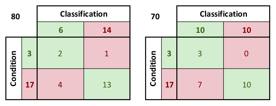
Egger presents the hypothetical data shown to the right. Two possible thresholds for classification are considered: threshold 1 at 80, and threshold 2 at 70. Red text indicates the radar rating for a bomber, and black text indicates a rating for something innocuous that would have been a false alarm.
The confusion matrices for each of these possible thresholds is shown below. Note that by decreasing the threshold from 80 to 70, all of the false negatives are eliminated, but this comes at the cost of three additional false positives. Note also that the relationships shown in the previous section hold when the numbers are construed as fractions of the total possible occurrences (such as A + B = 1 if A = 3/20 and B = 17/20). Typically, the confusion matrix will contain probabilities that are less than 1.
Other Possible Thresholds
Thresholds are generally characterized by their false positive rate and true positive rate. The false positive rate is the number of false positives divided by the total negatives. The thresholds could conceivably be set at any given point along the continuum of ratings. The false positive rate and true positive rate are calculated for thresholds at each possible point of the data presented previously. Those rates are used to generate the ROC curve shown alongside.
False negatives are also known as “type 1 errors,” and are generally the more serious type of error. False positives are also known as “type 2 errors.”
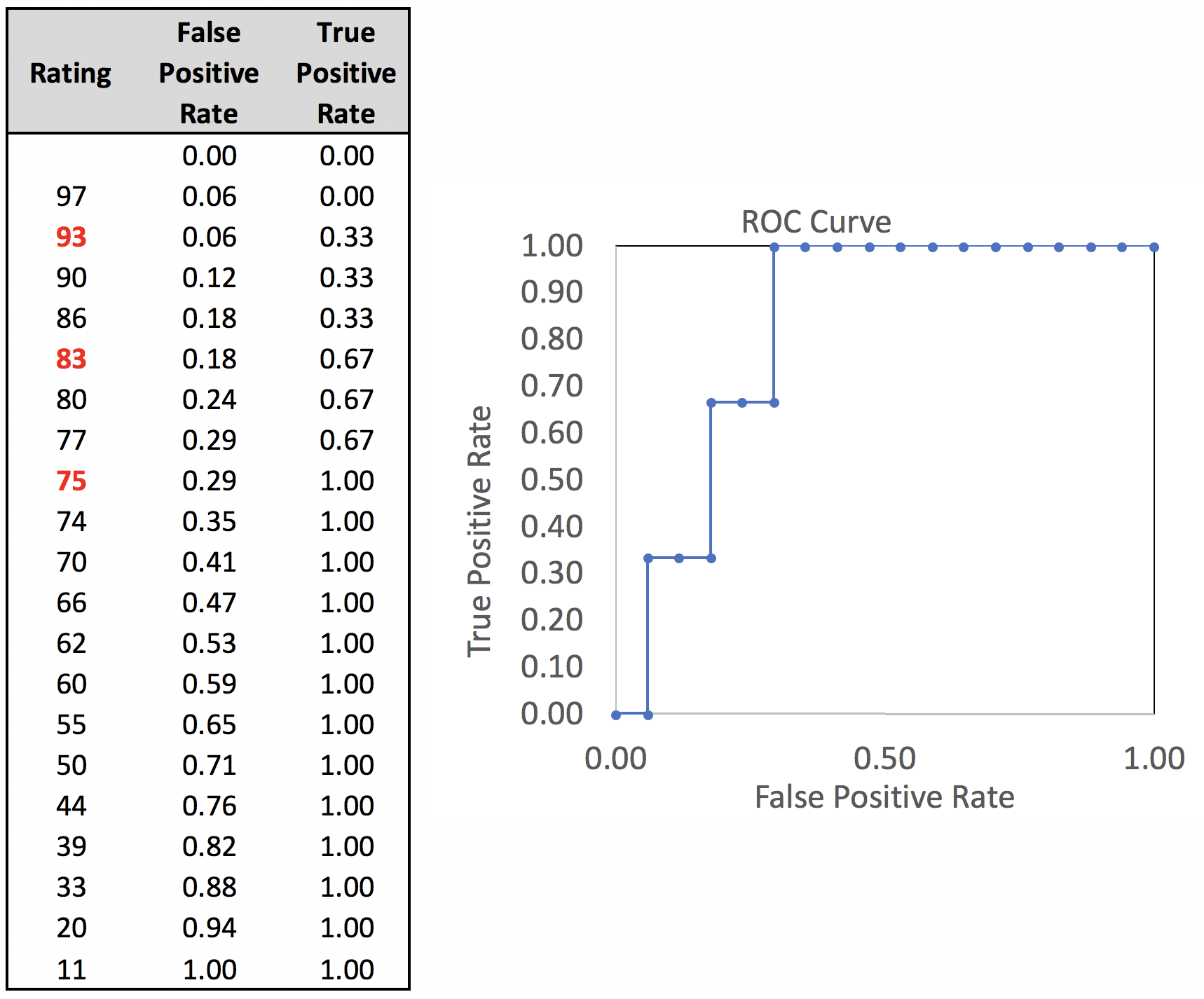
The area under the curve can be calculated as the sum of the areas of the rectangles that make up the area under the curve. In this case, the area adds up to 0.824, indicating that this classifier works reasonably well. Values for the area under the curve are between 0.5 and 1.0. A classifier that is a random guess will generate an AUC of 0.5. A perfect classifier with no false positives will generate an AUC of 1.0.
Note that the area under the curve is a property of the way the positive conditions are distributed among the negative conditions in the ordered ranking. This means that:
- it is not impacted by either the incidence of the positive conditions, or
- the relative costs of the two classification errors.
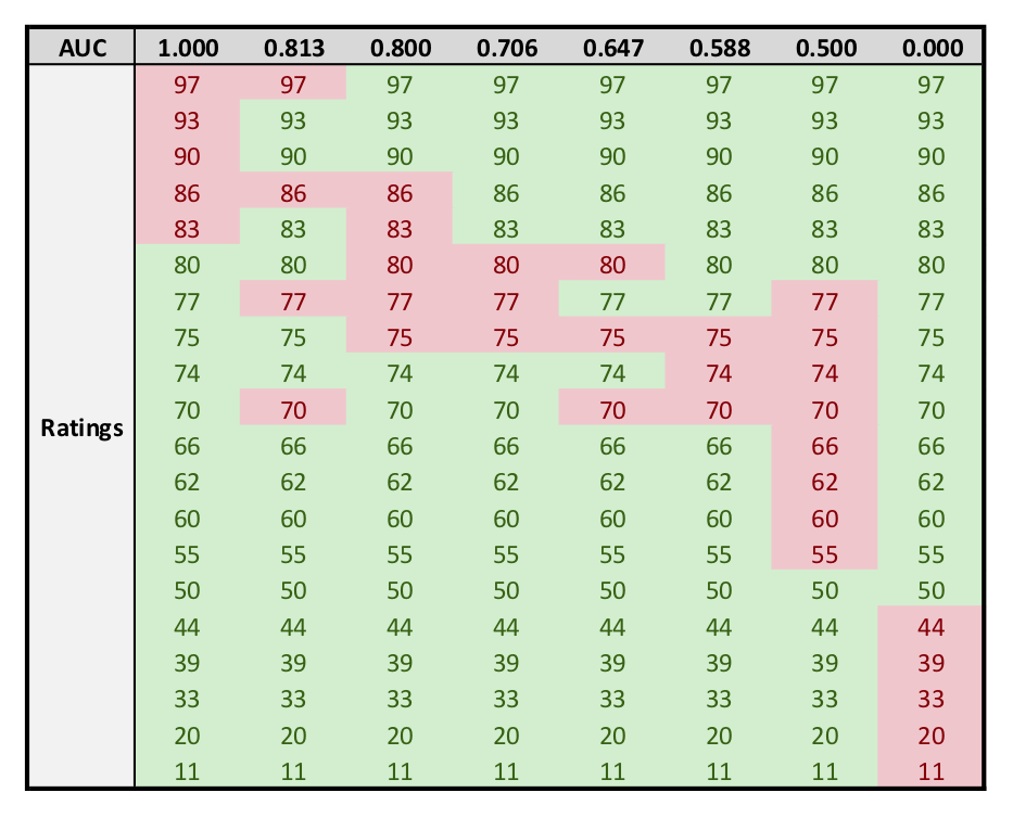
As a result, when either of those parameters are unstable or cannot be known, the AUC is the best performance metric available. Typical good AUCs are in the range from 0.65 to 0.85. A few examples of AUCs and their corresponding data distributions:
- 1.0: Top X rankings are positive condition, other 20-X rankings are negative.
- 0.8-1.0: Five of top 8 rankings are are positive condition, remaining 15 are negative.
- 0.667-1.0: Five of top 10 rankings are positive condition, remaining 15 are negative.
- 0.588-0.706: Three of the second group of 5 rankings (ranks 6-10) are positive condition, remaining 17 are negative.
- 0.5: Positive conditions are distributed symmetrically on either side of the middle ranking (ex: rankings 7 through 14 of 20 are positive condition, remainder negative).
- 0.0: Bottom X rankings are positive condition. Note that this can be remedied by redefining what constitutes a positive condition, so AUCs less than 0.5 are never seen in practice.
Determining the Optimal Threshold
The optimal threshold to use depends on the relative “costs” of each kind of classification error. In the hypothetical situation being considered, a false negative (classifying a bomber as a seagull) is far more expensive than a false positive (classifying a seagull as a bomber). This situation could change dramatically if, for example, aviation fuel supplies ran low. Or, if the number of available British pilots became very low, the risk might be that the aircraft scramble to intercept a flock of seagulls, and then German bombers attack from a different direction.
Assigning relative costs to false negatives and false positives, and then minimizing the total costs for each threshold, enables one to determine the optimal threshold.
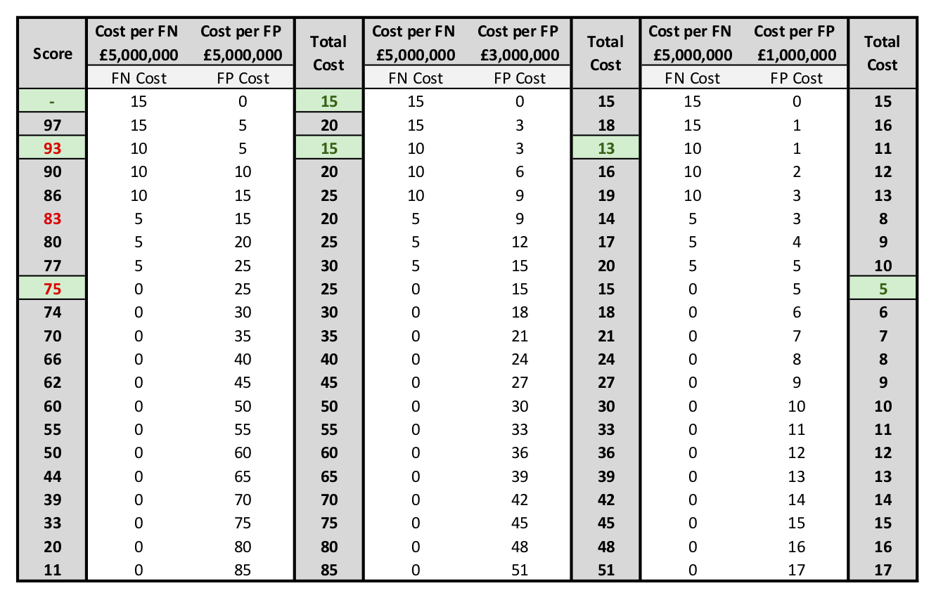
As shown in the image above, in the situation where the costs per FN equal the costs per FP, there are two possible thresholds with equivalent costs, namely never responding to radar signals, and responding to radar signals with rating 93 and above. For this particular ROC curve, for false positive costs less than approximately 1M pounds, there is no change to the optimal threshold. Further decreases in the threshold simply result in more false positives.
Medical Condition Testing Example
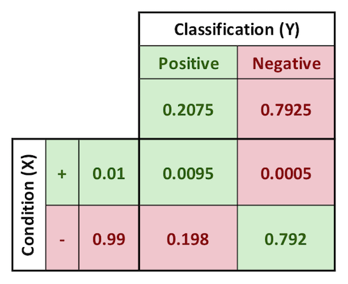
Egger presents the example of a test for a medical condition that yields this confusion matrix. The condition being tested for has an incidence of 1% in the general population.
This test is considered a “fairly good” test because of its high true positive rate, calculated below. The true positive rate is interpreted as meaning the probability that a patient would test positive given that they are positive for the condition. The true negative is the exact inverse of that statement.
The more pertinent conditional probability that patients should be interested in is something else, namely, what is the probability that you are positive for the condition, if you test positive? Or, similarly, the inverse. The first test mentioned is known as the positive predictive value. The inverse is known as the negative predictive value.
$$True\ Positive\ Rate = p(test\ POS | +) = \frac{0.0095}{0.01} = 95%$$
$$True\ Negative\ Rate = p(test\ NEG | -) = \frac{0.792}{0.99} = 80%$$
$$Positive\ Predictive\ Value = p(+ | test\ POS) = \frac{0.0095}{0.2075} = 4.58%$$
$$Negative\ Predictive\ Value = p(- | test\ NEG) = \frac{0.792}{0.7925} = 99.94%$$
In other words, a given patient has a 1% chance of being positive for the condition. If the patient tests positive for this particular condition, their chance of having the condition increases to roughly 4.6%. On the other hand, if they test negative, their probability of having the condition decreases from 1% to less than 0.06%. The true positive rate can sometimes be a misleading measure. In this context it is interpreted as meaning people who are positive for the condition will test positive 95% of the time.
Binary Classification with Multiple Input Variables
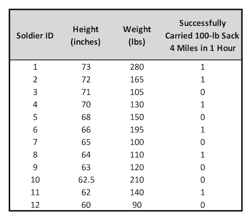
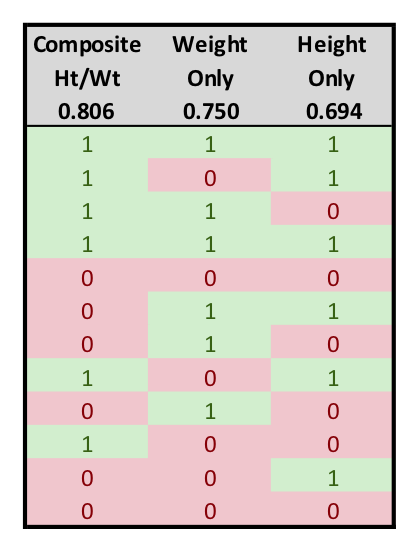
If multiple input variables are available in the data, it is often possible to combine them into a single parameter that will outperform either of the single metrics individually. As an example, Egger presents the set of data at right. Shown are the height and weight of a group of twelve soldiers, and whether they were able to successfully carry a 100-lb sack 4 miles in less than 1 hour.
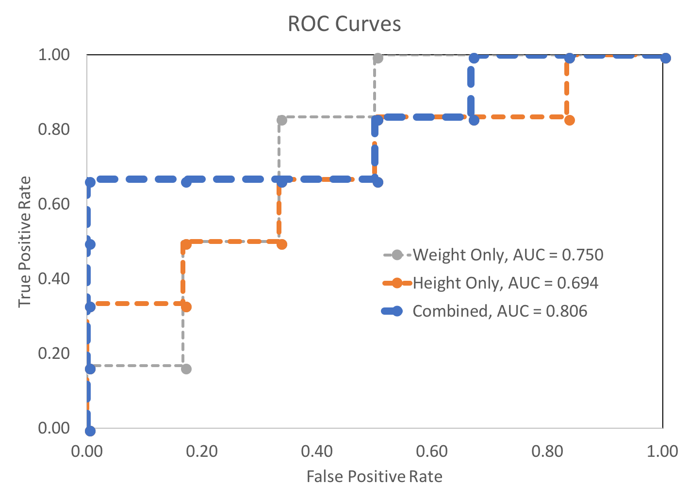
Using standardized height and weight data as individual inputs to two binary classifiers produced AUCs of 0.694 and 0.750, respectively. Combining the standardized height and weight figures (by summing them) into a single composite standard height and weight metric resulted in a AUC of 0.806.
Note that it is not necessarily the case that combining additional parameters will always reduce the AUC. The data Egger provided also included the soldiers' ages. The AUC for the age data only was 0.67, which is marginal, but still predictive. The soldiers' success likelihood was inversely related to their ages, as one would expect. Combining this age data into a height-weight-age composite metric resulted in a AUC of 0.778, which is less than the AUC for the height-weight composite metric on its own.
For another form of visual comparison, the relative ordering of the positive and negative conditions are shown in order of decreasing threshold for each of these classification styles. Finally, the three ROC curves are plotted below.
Confusion-Matrix-Terms.xlsx
Bombers-and-Seagulls.xlsx
Cancer-Diagnosis.xlsx
Binary-Performance-Metrics.xlsx
Review-of-AUC-for-ROC-Curve.xlsx
Forecasting-Soldier-Performance.xlsx
Some other content is taken from my notes on other aspects of the aforementioned Coursera course.