Supervised Learning on Census Dataset
In this project, I employ several supervised learning algorithms to model individuals' income using data collected from the 1994 US Census. The goal of the project is to construct a model that accurately predicts whether an individual makes more than $50,000.
The result of the project is a model that is 87.1% accurate (75.4% F-score) at predicting whether an individual makes more than $50,000 based on 13 datapoints. Training the identical model on the most important 5 datapoints results in a model that is 85.9% accurate (72.8% F-score).
This is page 1 of 3 for the project, where I
Explore and Preprocess the Data
The specific tasks break down as follows:
- Explore the Data
a. Plot Histograms for Continuous (Numerical) Feature Distributions
b. Plot Bar Charts for Discrete (Categories) Feature Distributions - Preprocess the Data
a. Split into Features and Labels
b. Transform Skewed Continuous Features
c. Normalize Continuous Features
d. One-Hot Encode Categorical Features
e. Suffle and Split the Data - Write the Processed Data to File
Exploring the Data
The dataset for this project was donated by Ron Kohavi and Barry Becker, after originally being published in the article “Scaling Up the Accuracy of Naive-Bayes Classifiers: A Decision-Tree Hybrid”. The article by Ron Kohavi is linked here. The data I investigate in this project consists of small changes to the original dataset, which is now available from the UCI Machine Learning Repository. Specifically, these changes include removing the ‘fnlwgt’ feature and records with missing or ill-formatted entries.
import numpy as np
import pandas as pd
from time import time

%matplotlib inline
import matplotlib.pyplot as plt
import seaborn as sns

c = pd.read_csv('data/census.csv')
The outcome (label) is contained in the final column, income.
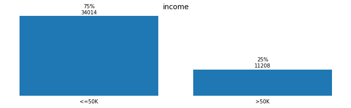
n_records = c.shape[0]
n_greater_50k = c[c['income']=='>50K'].shape[0]
n_at_most_50k = c[c['income']=='<=50K'].shape[0]
greater_50k_percent = n_greater_50k/n_records

print('                 Total records: {}'.format(n_records))
print(' Individuals with income >$50K: {}'.format(n_greater_50k))
print('Individuals with income <=$50K: {}'.format(n_at_most_50k))
print('        %age with income >$50K: {:.1%}'.format(greater_50k_percent))
                 Total records: 45222
 Individuals with income >$50K: 11208
Individuals with income <=$50K: 34014
        %age with income >$50K: 24.8%
Among the features, there are:
- 5 continuous, numerical features and
- 8 discrete, categorical features
c.info()
<class 'pandas.core.frame.DataFrame'>
RangeIndex: 45222 entries, 0 to 45221
Data columns (total 14 columns):
 #   Column           Non-Null Count  Dtype
---  ------           --------------  -----
 0   age              45222 non-null  int64
 1   workclass        45222 non-null  object
 2   education_level  45222 non-null  object
 3   education-num    45222 non-null  float64
 4   marital-status   45222 non-null  object
 5   occupation       45222 non-null  object
 6   relationship     45222 non-null  object
 7   race             45222 non-null  object
 8   sex              45222 non-null  object
 9   capital-gain     45222 non-null  float64
 10  capital-loss     45222 non-null  float64
 11  hours-per-week   45222 non-null  float64
 12  native-country   45222 non-null  object
 13  income           45222 non-null  object
dtypes: float64(4), int64(1), object(9)
memory usage: 4.8+ MB
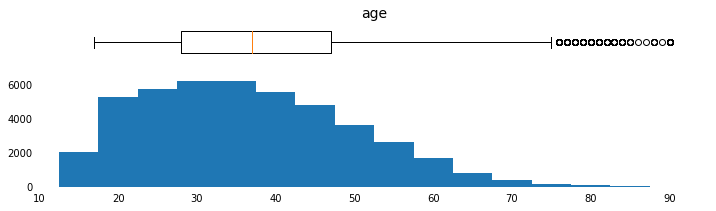
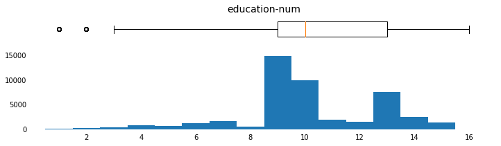
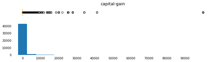
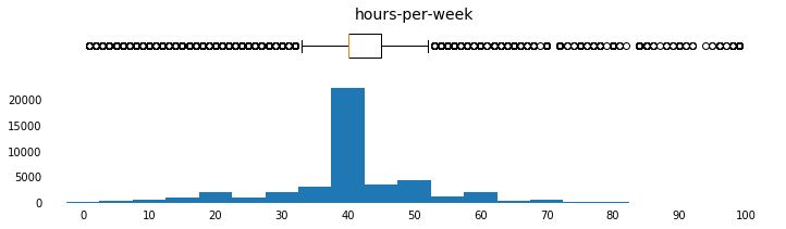
Plot Histograms for Continuous Feature Distributions
def plot_continuous_distributions(field, bins=None, xlim_list=None, xtick_list=None):
    fig, (b, h) = plt.subplots(ncols=1, nrows=2,
                               sharex=True,
                               gridspec_kw={'height_ratios':[1,3]},
                               figsize=(12,3))
    b.boxplot(c[field],
              widths=0.6,
              vert=False)
    b.set_title(field,
                fontsize=14)
    b.set_yticks([])
    b.set_xticks(xtick_list)

    h.hist(c[field],
           bins=bins,
           align='left')
    h.set_xlim(xlim_list)
    h.set_xticks(xtick_list)

    for ax in [b, h]:
        for spine in ax.spines.values():
            spine.set_visible(False)
        ax.tick_params(
            axis='x',
            bottom=False)
        ax.tick_params(
            axis='y',
            left=False,
            right=False)
params = [('age',np.arange(15,95,5),[10,95],np.arange(10,100,10)),
          ('education-num',np.arange(0,17,1),[0,17],np.arange(2,18,2)),
          ('capital-gain',np.arange(0,100000,5000),[-5000,105000],
           np.arange(0,100000,10000)),
          ('capital-loss',np.arange(0,4500,250),[-250,5000],np.arange(0,4500,500)),
          ('hours-per-week',np.arange(0,100,5),[-5,105],np.arange(0,110,10))]
for field, bins, xlim_list, x_tick_list in params:
    plot_continuous_distributions(field, bins, xlim_list, x_tick_list)


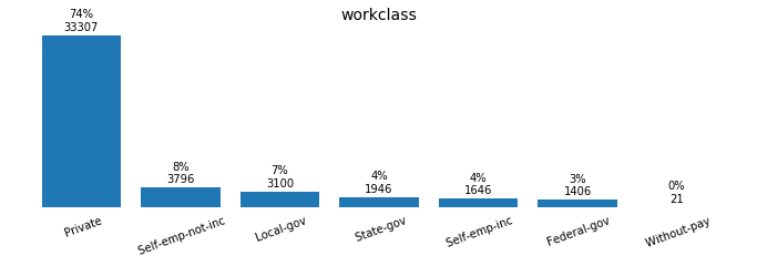
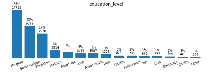
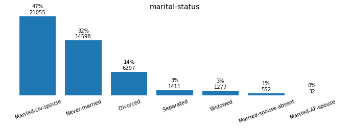
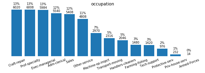
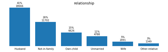
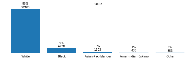
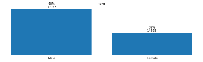
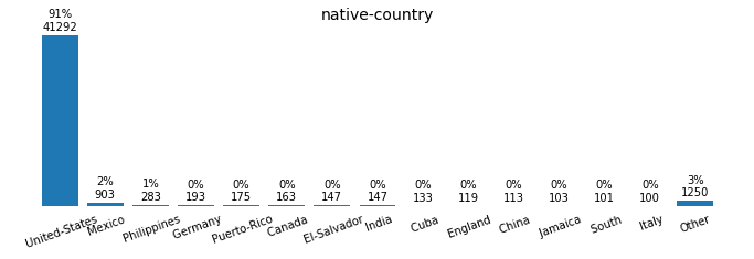
Plot Bar Charts for Discrete Feature Distributions
def plot_discrete_distributions(field):
    summary = (pd.DataFrame(c[field].value_counts())
               .reset_index())

    if summary.shape[0] > 14:
        other_total = summary[14:][field].sum()
        summary = summary[:14]
        summary = summary.append({'index':'Other',
                                  field:other_total},
                                 ignore_index=True)

    summary['percentage'] = round(summary[field]/summary[field].sum()*100.,
                                  0).astype(int)
    labels = summary['index']
    position = summary.index
    counts = summary[field]

    plt.figure(figsize=(12,3))

    plt.bar(position, counts, align='center')

    if summary.shape[0] > 6:
        rotation = 20
    else:
        rotation = 0

    plt.xticks(position, labels, rotation=rotation)

    rects = plt.gca().patches
    for n, r in enumerate(rects):
        height = r.get_height()
        plt.gca().text(r.get_x() + r.get_width() / 2,
                       height + plt.gca().get_ylim()[1]*0.08,
                       str(summary['percentage'][n]) + '%\n' + str(height),
                       ha='center',
                       va='center')

    for spine in plt.gca().spines.values():
        spine.set_visible(False)
    plt.gca().tick_params(
        axis='x',
        bottom=False)
    plt.gca().tick_params(
        axis='y',
        left=False,
        labelleft=False,
        right=False)

    plt.title(field,
              fontsize=14);
for field in ['workclass', 'education_level', 'marital-status', 'occupation',
              'relationship', 'race', 'sex', 'native-country', 'income']:
    plot_discrete_distributions(field)
Preprocessing the Data
The data must be preprocessed before it can be used as input for machine learning algorithms. This “preprocessing” consists of handling invalid or missing entries, a broad term for this is cleaning, as well as other formatting and restructuring.
Split into Features and Labels
labels_raw = c['income']
features_raw = c.drop(columns=['income'])
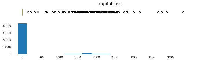
Transforming Skewed Continuous Features
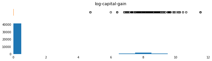
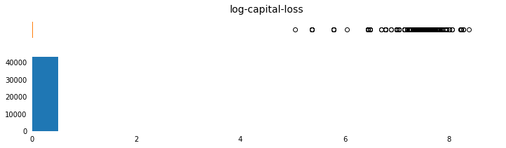
capital-gain and capital-loss are both highly-skewed features. The common practice is to apply a logarithmic transformation so that the very large and very small values do not negatively affect the performance of a learning algorithm.
Note that since the logarithm of 0 is undefined, I translate the values by a small amount above 0 in order to apply the logarithm successfully.
Note that the only features that are log transformed, below, are the features in the list of skewed fields.
skewed = ['capital-gain', 'capital-loss']
features_log_transformed = pd.DataFrame(data = features_raw)
features_log_transformed[skewed] = features_raw[skewed].apply(lambda x: np.log(x + 1))
Visualize the change.
c['log-capital-gain'] = features_log_transformed['capital-gain']
c['log-capital-loss'] = features_log_transformed['capital-loss']
params = [('capital-gain',np.arange(0,100000,5000),[-5000,105000],
           np.arange(0,100000,10000)),
          ('log-capital-gain',np.arange(0,12,1),[0,12],np.arange(0,14,2)),
          ('capital-loss',np.arange(0,4500,250),[-250,5000],np.arange(0,4500,500)),
          ('log-capital-loss',np.arange(0,8,1),[0,9],np.arange(0,10,2))]
for field, bins, xlim_list, x_tick_list in params:
    plot_continuous_distributions(field, bins, xlim_list, x_tick_list)
c = c.drop(columns=['log-capital-gain','log-capital-loss'])

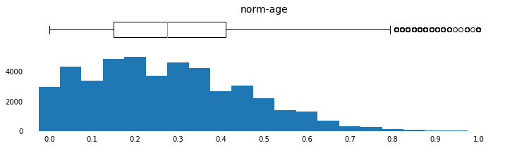
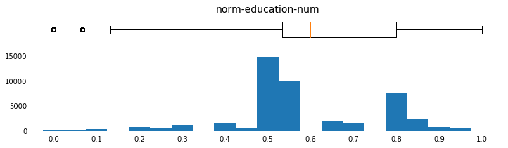
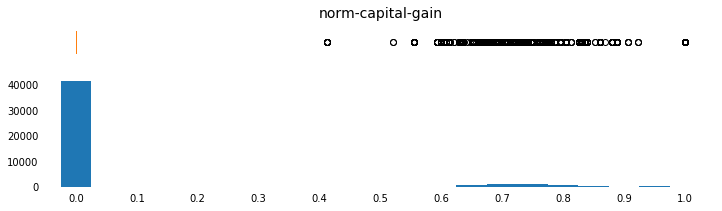
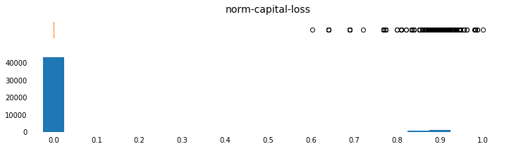
Normalizing Numerical Features
In addition to transforming highly skewed features, it is also good practice to scale numerical features. This does not change the shape of the distribution like a log transform. It does, however, ensure that each feature is treated equally when applying supervised learning.
Note that the capital-gain and capital-loss fields were already log-transformed and are now being min-max-scaled.
from sklearn.preprocessing import MinMaxScaler

scaler = MinMaxScaler() # default=(0, 1)
numerical = ['age', 'education-num', 'capital-gain', 'capital-loss', 'hours-per-week']

features_log_minmax_transform = \
    pd.DataFrame(data = features_log_transformed)

features_log_minmax_transform[numerical] = \
    scaler.fit_transform(features_log_transformed[numerical])
Visualize the change.
for col in numerical:
c['norm-' + col] = features_log_minmax_transform[col]
params = [('age',np.arange(15,95,5),[10,95],np.arange(10,100,10)),
('norm-age',np.arange(0,1.05,0.05),[-0.05,1.05],np.arange(0,1.1,0.1)),
('education-num',np.arange(0,17,1),[0,17],np.arange(2,18,2)),
('norm-education-num',np.arange(0,1.05,0.05),[-0.05,1.05],np.arange(0,1.1,0.1)),
('capital-gain',np.arange(0,100000,5000),[-5000,105000],
np.arange(0,100000,10000)),
('norm-capital-gain',np.arange(0,1.05,0.05),[-0.05,1.05],np.arange(0,1.1,0.1)),
('capital-loss',np.arange(0,4500,250),[-250,5000],np.arange(0,4500,500)),
('norm-capital-loss',np.arange(0,1.05,0.05),[-0.05,1.05],np.arange(0,1.1,0.1)),
('hours-per-week',np.arange(0,100,5),[-5,105],np.arange(0,110,10)),
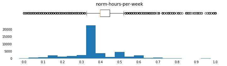
('norm-hours-per-week',np.arange(0,1.05,0.05),[-0.05,1.05],np.arange(0,1.1,0.1))]
for field, bins, xlim_list, x_tick_list in params:
plot_continuous_distributions(field, bins, xlim_list, x_tick_list)
c = c.drop(columns=c.columns[c.columns.str.contains('norm')])


One-Hot Encode Categoricals
Learning algorithms generally expect numeric input. This dataset has 8 features that are categorical, which will need to be converted. This is generally accomplished with one-hot encoding the data. The pandas.get_dummies() method will be used for one-hot encoding.
| someFeature | |
|---|---|
| 0 | B |
| 1 | C |
| 2 | A |
After One-Hot Encode
| someFeature_A | someFeature_B | someFeature_C |
|---|---|---|
| 0 | 1 | 0 |
| 0 | 0 | 1 |
| 1 | 0 | 0 |
The target label, income, must also be converted. Since there are only two possible categories, we can avoid using one-hot encoding and simply encode those categories as 0 or 1.
features_final = pd.get_dummies(features_log_minmax_transform)

before_encoding_cols = len(features_log_minmax_transform.columns)
after_encoding_cols = len(features_final.columns)

print("Before one-hot encode: {} features".format(before_encoding_cols))
print(" After one-hot encode: {} features".format(after_encoding_cols))
Before one-hot encode: 13 features
 After one-hot encode: 103 features
labels_final = (labels_raw
                .replace('<=50K',0)
                .replace('>50K',1))
Shuffle and Split the Data
Use an 80/20 Training/Testing split.
from sklearn.model_selection import train_test_split

X_train, X_test, y_train, y_test = train_test_split(features_final,
                                                    labels_final,
                                                    test_size = 0.2,
                                                    random_state = 0)

print("Training set: {} samples".format(X_train.shape[0]))
print(" Testing set: {} samples".format(X_test.shape[0]))
Training set: 36177 samples
 Testing set: 9045 samples
Write to File
for data_subset, name in [(X_train, 'X_train'),
                          (X_test,  'X_test'),
                          (y_train, 'y_train'),
                          (y_test,  'y_test')]:
    data_subset.to_csv('processed/' + name + '.csv')