Using PCA on MNIST
PCA is commonly used with high dimensional data. One type of high dimensional data is images. A classic example of working with image data is the MNIST dataset, which was open sourced in the late 1990s by researchers across Microsoft, Google, and NYU.
import pandas as pd
import numpy as np
from sklearn.decomposition import PCA
from sklearn.preprocessing import StandardScaler
from sklearn.ensemble import RandomForestClassifier
from sklearn.model_selection import train_test_split
from sklearn.metrics import confusion_matrix, accuracy_score

import matplotlib.pyplot as plt
import seaborn as sns
Info about the pixel values linked here.
train = pd.read_csv('./pca-on-mnist/train.csv')
train.fillna(0, inplace=True)
print(str(train.shape[0]) + ' rows')
train.head()
6304 rows
| label | pixel0 | pixel1 | pixel2 | pixel3 | pixel4 | pixel5 | pixel6 | pixel7 | pixel8 | ... | pixel774 | pixel775 | pixel776 | pixel777 | pixel778 | pixel779 | pixel780 | pixel781 | pixel782 | pixel783 | |
|---|---|---|---|---|---|---|---|---|---|---|---|---|---|---|---|---|---|---|---|---|---|
| 0 | 1 | 0 | 0 | 0 | 0 | 0 | 0 | 0 | 0 | 0 | ... | 0.0 | 0.0 | 0.0 | 0.0 | 0.0 | 0.0 | 0.0 | 0.0 | 0.0 | 0.0 |
| 1 | 0 | 0 | 0 | 0 | 0 | 0 | 0 | 0 | 0 | 0 | ... | 0.0 | 0.0 | 0.0 | 0.0 | 0.0 | 0.0 | 0.0 | 0.0 | 0.0 | 0.0 |
| 2 | 1 | 0 | 0 | 0 | 0 | 0 | 0 | 0 | 0 | 0 | ... | 0.0 | 0.0 | 0.0 | 0.0 | 0.0 | 0.0 | 0.0 | 0.0 | 0.0 | 0.0 |
| 3 | 4 | 0 | 0 | 0 | 0 | 0 | 0 | 0 | 0 | 0 | ... | 0.0 | 0.0 | 0.0 | 0.0 | 0.0 | 0.0 | 0.0 | 0.0 | 0.0 | 0.0 |
| 4 | 0 | 0 | 0 | 0 | 0 | 0 | 0 | 0 | 0 | 0 | ... | 0.0 | 0.0 | 0.0 | 0.0 | 0.0 | 0.0 | 0.0 | 0.0 | 0.0 | 0.0 |
5 rows × 785 columns
Save the labels to a Pandas series target, then drop the label feature.
y = train['label']
X = train.drop("label",axis=1)
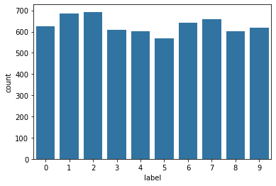
A very quick look at the data shows that all the labels appear roughly 600 times
sns.countplot(y, color = sns.color_palette()[0]);
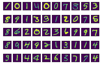
This helper function prints a grid of the number images.
def show_images(num_images):
    if num_images % 10 == 0 and num_images <= 100:
        for digit_num in range(0,num_images):
            plt.subplot(num_images/10,10,digit_num+1) #create subplots
            mat_data = X.iloc[digit_num].values.reshape(28,28)  #reshape images
            plt.imshow(mat_data) #plot the data
            plt.xticks([]) #removes numbered labels on x-axis
            plt.yticks([]) #removes numbered labels on y-axis
show_images(50)
This helper function shows the first 50 images of any one type of number.
def show_images_by_digit(digit_to_see):
    if digit_to_see in list(range(10)):
        indices = np.where(y == digit_to_see) # pull indices for num of interest
        for digit_num in range(0,50):
            plt.subplot(5,10, digit_num+1) #create subplots
            #reshape images
            mat_data = X.iloc[indices[0][digit_num]].values.reshape(28,28)
            plt.imshow(mat_data) #plot the data
            plt.xticks([]) #removes numbered labels on x-axis
            plt.yticks([]) #removes numbered labels on y-axis
show_images_by_digit(1)
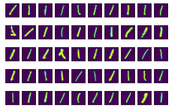
Some of these ones are pretty wild looking… One common way to use PCA is to reduce the dimensionality of high dimensionality data that you want to use for prediction, but the results seem to be overfitting (potentially because there is a lot of noise in the data. Which can certainly be the case with image data).
Let’s take a first pass on creating a simple model to predict the values of the images using all of the data. No fitting at this time.
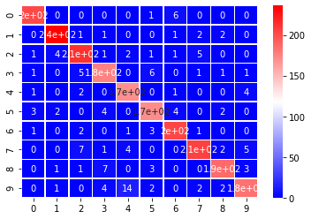
The helper function below fits a simple random forest classifier on all of the data. No fitting is performed. It then prints the accuracy of the trained model and a confusion matrix for the predictions. Any values on the diagonal were correctly predicted; any values off the diagonal is something where we predicted a value that wasn’t true.
def fit_random_forest_classifier(X, y, print_output=True):
    X_train, X_test, y_train, y_test = train_test_split(X, y,
                                                        test_size=0.33,
                                                        random_state=42)

    clf = RandomForestClassifier(n_estimators=100, max_depth=None)

    clf.fit(X_train, y_train)

    y_preds = clf.predict(X_test)

    acc = accuracy_score(y_test, y_preds)

    if print_output == True:
        mat = confusion_matrix(y_test, y_preds)
        sns.heatmap(mat, annot=True, cmap='bwr', linewidths=.5)

        print('Input Shape: {}'.format(X_train.shape))
        print('Accuracy: {:2.2%}\n'.format(acc))
        print(mat)

    return acc
fit_random_forest_classifier(X, y);
Input Shape: (4223, 784)
Accuracy: 93.56%

[[202   0   0   0   0   1   6   0   0   0]
 [  0 236   1   1   0   0   1   2   2   0]
 [  1   4 213   1   2   1   1   5   0   0]
 [  1   0   5 176   0   6   0   1   1   1]
 [  1   0   2   0 170   0   1   0   0   4]
 [  3   2   0   4   0 171   4   0   2   0]
 [  1   0   2   0   1   3 203   1   0   0]
 [  0   0   7   1   4   0   0 206   2   5]
 [  0   1   1   7   0   3   0   0 187   3]
 [  0   1   0   4  14   2   0   2   2 183]]
The above model does pretty well on the test set using all of the data, let’s see how well a model can do with a much lower number of features. Perhaps, we can do as well or better by reducing the noise in the original features.
Working with unsupervised techniques in scikit learn follows a similar process as working with supervised techniques, but excludes predicting and scoring, and instead we just need to transform our data.
- Instantiate
- Fit
- Transform
Because all the features are on the same scale from 0 to 255, scaling isn’t necessary here. That said, the function below scales the data so it can be used to perform PCA on this dataset, but also any other dataset.
This function transforms the data using PCA to create n_components and provides the results of the transformation back.
def do_pca(n_components, data):
    X = StandardScaler().fit_transform(data)
    pca = PCA(n_components)
    X_pca = pca.fit_transform(X)
    return pca, X_pca
As a first pass, do PCA on just the two first principal components. So, we are fitting the exact same random forest classifier on much lower-dimensional data.
pca, X_pca = do_pca(2, X)
fit_random_forest_classifier(X_pca, y);
Input Shape: (4223, 2)
Accuracy: 34.65%

[[110   0  39   8   7  13  25   0   7   0]
 [  0 207   0   4   2   6   5   5   8   6]
 [ 39   2  75  26  15  18  36   0  12   5]
 [  9   2  35  21  22  27  24  13  24  14]
 [  6   4  20  17  48  16  17  11  10  29]
 [  9   8  32  28  11  23  30   5  31   9]
 [ 31   5  53  19   9  27  36   3  26   2]
 [  2   3   5   9  33   9   4  95   7  58]
 [  7   5  26  27  24  29  25  10  39  10]
 [  2  12   4  13  30   8   4  58  10  67]]
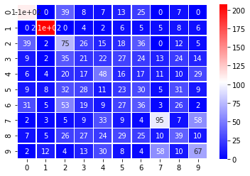
An accuracy around 33% indicates that just two principal components isn’t giving enough information to clearly identify the digits.
In order to see how the PCA components are separating out the digits, lets use the following helper function to plot the data in a 2 dimensional space to view separation.
def plot_components(X, y):
    x_min, x_max = np.min(X, 0), np.max(X, 0)
    X = (X - x_min) / (x_max - x_min)
    plt.figure(figsize=(10, 6))
    for i in range(X.shape[0]):
        plt.text(X[i, 0], X[i, 1], str(y[i]),
                 color=plt.cm.Set1(y[i]),
                 fontdict={'size': 15})

    plt.xticks([]), plt.yticks([]), plt.ylim([-0.1,1.1]), plt.xlim([-0.1,1.1])
plot_components(X_pca[:500], y[:500])
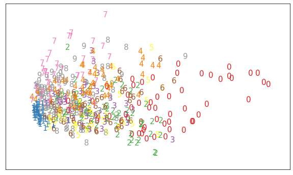
We see that it does a reasonable job separating out zeros, sevens, and ones. But, this is an indication of what we saw in the confusion matrix. The numbers are pretty jumbled.
Perform PCA and Gauge Max Accuracy
As a final step, iteratively check how many principal components would be required in order to reach a reasonable accuracy with the same random forest classifier.
acc_list, pc_list = [], []
for pc in range(2,101):
    pca, X_pca = do_pca(pc, X)
    acc = fit_random_forest_classifier(X_pca, y, print_output=False);
    acc_list.append(acc)
    pc_list.append(pc)
plt.figure(figsize=[12,9])
plt.scatter(pc_list, acc_list)
plt.title('Random Forest Plot Accuarcy as a Function of Number of Principal Components')
plt.xlabel('Principal Components')
plt.ylabel('Accuracy');
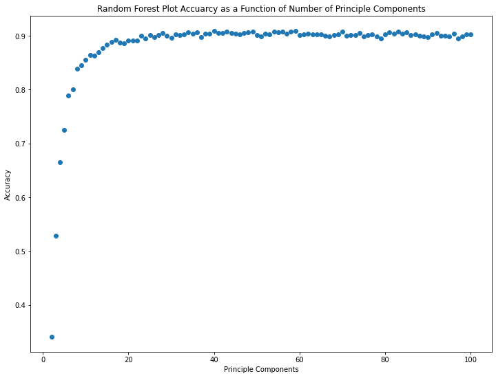
The marginal value of additional principal components up to number 10 or so is huge. Beyond 20 or so, it seems like there are diminishing returns.
np.max(acc_list), pc_list[np.where(acc_list == np.max(acc_list))[0][0]]
(0.9091782796732341, 59)
The maximum accuracy attained is 90.9% with 59 principal components. Beyond this peak, additional principal components appear to mostly contribute noise.
Note that 59 principal component columns is a significant reduction in dataset complexity from the original 784 pixel columns!
Examine PCA Attributes and Components
Two of the main aspects of principal components are:
- The amount of variability captured by the component. This is called an eigenvalue.
- The components themselves. The principal components themselves, each component is a vector of weights. In this case, the principal components help us understand which pixels of the image are most helpful in identifying the difference between digits. Principal components are also known as eigenvectors.
Now, fit PCA with 15 components.
pca, X_pca = do_pca(15, X)
The following helper function plots the amount of variance explained by each component. Each of the bars is associated with one of the principal components. Note that the first component will ALWAYS have the most amount of variability explained. The amount of variability explained decreases with each additional component.
def scree_plot(pca):
    num_components = len(pca.explained_variance_ratio_)
    ind = np.arange(num_components)
    vals = pca.explained_variance_ratio_

    plt.figure(figsize=(10, 6))
    ax = plt.subplot(111)
    cumvals = np.cumsum(vals)
    ax.bar(ind, vals)
    ax.plot(ind, cumvals)
    for i in range(num_components):
        ax.annotate(r"%s%%" % ((str(round(vals[i]*100,1))[:3])), (ind[i]+0.2, vals[i]),
                    va="bottom",
                    ha="center",
                    fontsize=12)

    ax.xaxis.set_tick_params(width=0)
    ax.yaxis.set_tick_params(width=1, length=6)

    ax.set_xlabel("Principal Component")
    ax.set_ylabel("Variance Explained (%)")
    plt.title('Explained Variance Per Principal Component')
scree_plot(pca)
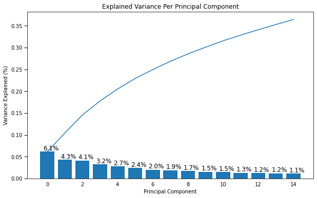
Each of the bars represents the amount of variability explained by each component. So you can see the first component explains 6.1% of the variability in the image data. The second explains 4.3% of the variability and so on.
This is one way of determing how well an unsupervised algorithm is predicting what’s happening with the data. Often the number of components is chosen based on the total amount of variability explained by the components. By using the first 15 components we capture almost 35% of the total variability.
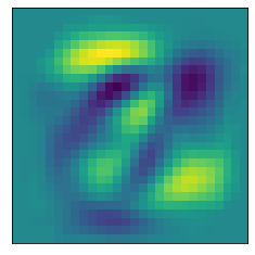
Let’s see if we can get a better idea of what aspects of the image the components might be picking up on. To do this we will work with the components_ attribute of the pca object. Looking at the shape of components shows us that each component gives the weights for each pixel.
The following helper functions plot a heat map of what pixel patterns are most important to predicting a given number. The bright yellow pixels are heavily weighted and the darker blue pixels are lighter weight.
def plot_component(pca, comp):
    if comp <= len(pca.components_):
        mat_data = np.asmatrix(pca.components_[comp]).reshape(28,28)  #reshape images
        plt.imshow(mat_data); #plot the data
        plt.xticks([]) #removes numbered labels on x-axis
        plt.yticks([]) #removes numbered labels on y-axis
plot_component(pca, 0)
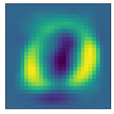
Note that these images are associated with the index of the Principal Components, and the first principal component just happened to be the first (0th) item in the list.
plot_component(pca, 1)
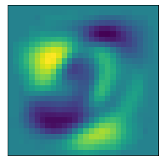
plot_component(pca, 2)