Clustering Examples
import numpy as np
import matplotlib.pyplot as plt
from mpl_toolkits.mplot3d import Axes3D
from sklearn.cluster import KMeans
from sklearn.datasets import make_blobs

%matplotlib inline

# Make the images larger
plt.rcParams['figure.figsize'] = (8, 6)
Visuals of Datasets
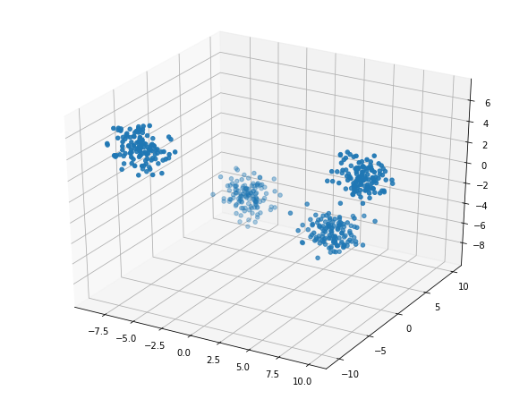
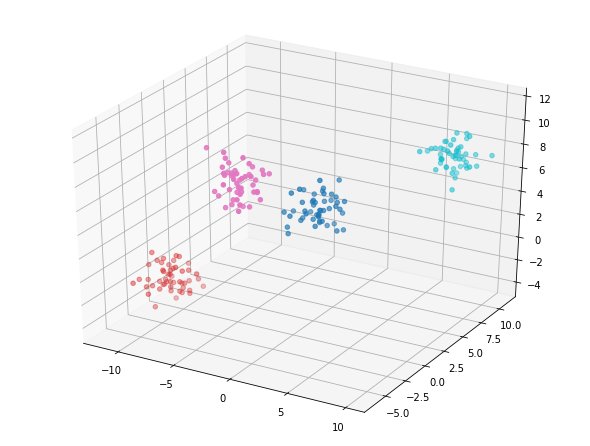
X, y = make_blobs(n_samples=500, n_features=3, centers=4, random_state=5)

fig = plt.figure();
ax = Axes3D(fig)
ax.scatter(X[:, 0], X[:, 1], X[:, 2]);
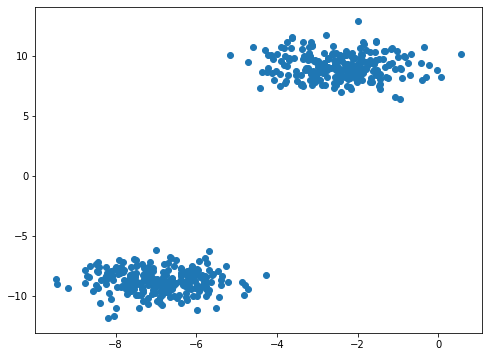
2 clusters in the image below.
Z, y = make_blobs(n_samples=500, n_features=5, centers=2, random_state=42)

fig = plt.figure()
plt.scatter(Z[:, 0], Z[:, 1]);
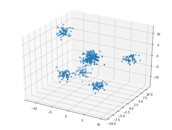
Generate Example 3 Data
Appears to be 6 clusters in the image below.
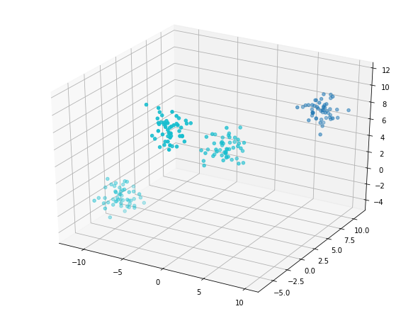
T, y = make_blobs(n_samples=500, n_features=5, centers=8, random_state=5)

fig = plt.figure();
ax = Axes3D(fig)
ax.scatter(T[:, 1], T[:, 3], T[:, 4]);
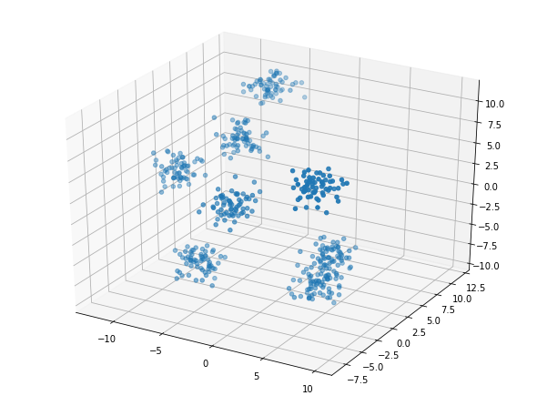
Plot data for Example 4
But, this is the same data as in Example 3. We see that rotated slightly there are actually at least 7 groups in this data.
fig = plt.figure();
ax = Axes3D(fig)
ax.scatter(T[:, 1], T[:, 2], T[:, 3]);
Examples with More Labels
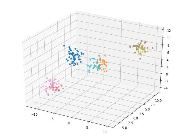
Create a dataset with 200 data points (rows), 5 features (columns), and 4 centers.
data, y = make_blobs(n_samples=200,
                     n_features=5,
                     centers=4,
                     random_state=8)
3 steps to use KMeans:
- Instantiate model.
- Fit model to data.
- Predict labels for data.
kmeans_4 = KMeans(n_clusters=4,
                  random_state=8)  # instantiate your model
model_4 = kmeans_4.fit(data)       # fit the model to your data using kmeans_4
labels_4 = model_4.predict(data)   # predict labels using model_4 on your dataset

fig = plt.figure();
ax = Axes3D(fig)
ax.scatter(data[:, 0],
           data[:, 1],
           data[:, 2],
           c=labels_4,
           cmap='tab10');
kmeans_2 = KMeans(n_clusters=2,
                  random_state=8)  # instantiate your model
model_2 = kmeans_2.fit(data)       # fit the model to your data using kmeans_4
labels_2 = model_2.predict(data)   # predict labels using model_4 on your dataset

fig = plt.figure();
ax = Axes3D(fig)
ax.scatter(data[:, 0],
           data[:, 1],
           data[:, 2],
           c=labels_2,
           cmap='tab10');
kmeans_7 = KMeans(n_clusters=7,
                  random_state=8)  # instantiate your model
model_7 = kmeans_7.fit(data)       # fit the model to your data using kmeans_4
labels_7 = model_7.predict(data)   # predict labels using model_4 on your dataset

fig = plt.figure();
ax = Axes3D(fig)
ax.scatter(data[:, 0],
           data[:, 1],
           data[:, 2],
           c=labels_7,
           cmap='tab10');
Build a Scree Plot
The score method that takes the data as a parameter and returns a value that is an indication of how far the points are from the centroids. That number is the average distance of the data from the centroids.
scores = []
centers = list(range(1,11))
for center in centers:
    kmeans = KMeans(n_clusters=center)
    model = kmeans.fit(data)
    score = np.abs(model.score(data))
    scores.append(score)
plt.plot(centers, scores, linestyle='--', marker='o', color='b');
plt.xlabel('K');
plt.ylabel('SSE');
plt.title('SSE vs. K');
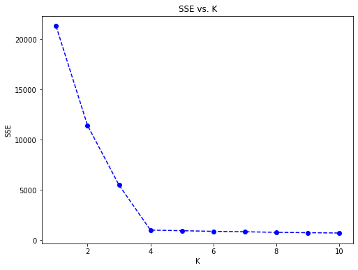
As shown in the scree plot, the “elbow” and ideal number of clusters appears to be 4.
This content is taken from notes I took while pursuing the Intro to Machine Learning with Pytorch nanodegree certification.