Analysis Plans
This part of the analysis project process assumes that a S.M.A.R.T. (Specific, Measurable, Attainable, Realistic, and Time-Bound) goal for the project has been identified. Tips for collaboratively developing a SMART goal are elaborated in the previous post.
Structured Pyramid Analysis Plans
Once a SMART goal has been identified, the next step is to distill that goal into a series of concrete action steps that will form the work of completing the project. The approach that Professor Borg outlines is called a Structured Pyramid Analysis Plan.
The rationale for using a structured plan like this is to avoid the very inefficient process of exploring a data set aimlessly, without hypotheses. This is especially true for analytics teams, that would have a difficult time collaborating without some kind of roadmap to use for direction. In summary, plans of this type help data analysts:
- stay on task,
- identify gaps in thinking,
- explain their thinking to others,
- report their progress, and
- work alongside others in a team.
An SPAP is outlined in the following image. The terms are defined beneath it.
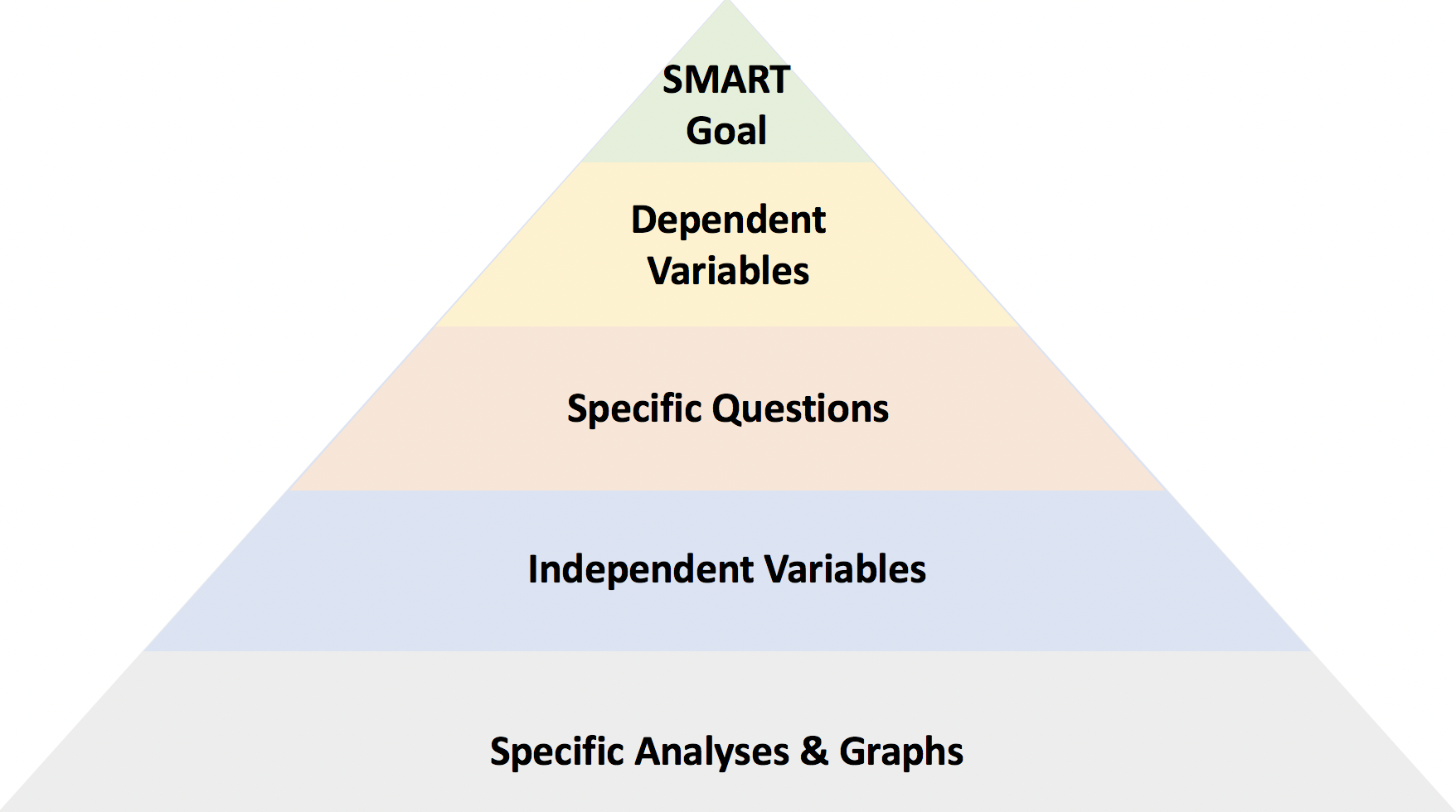
SMART Goal: a goal that is Specific, Measurable, Attainable, Realistic, and Time-Bound.
Dependent Variables: variables that directly pertain to the accomplishment of the S.M.A.R.T. goal.
Specific Questions to Investigate: ideas and intuitions about what parameters may impact the independent variables.
Independent Variables: variables that may help explain the possible connections in the questions, above, to the dependent variables.
Specific Analyses: Statistical analyses and plots of independent versus dependent variables.
A Worked Example
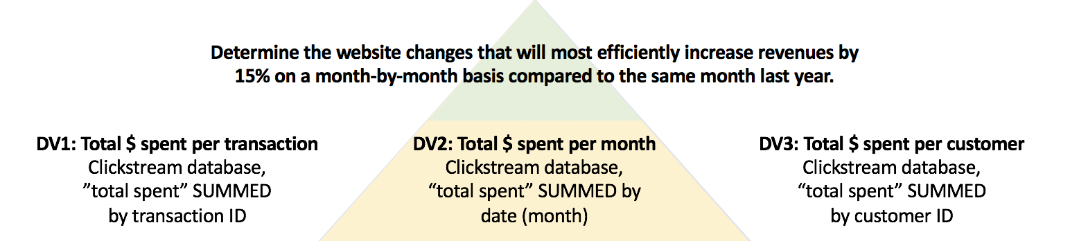
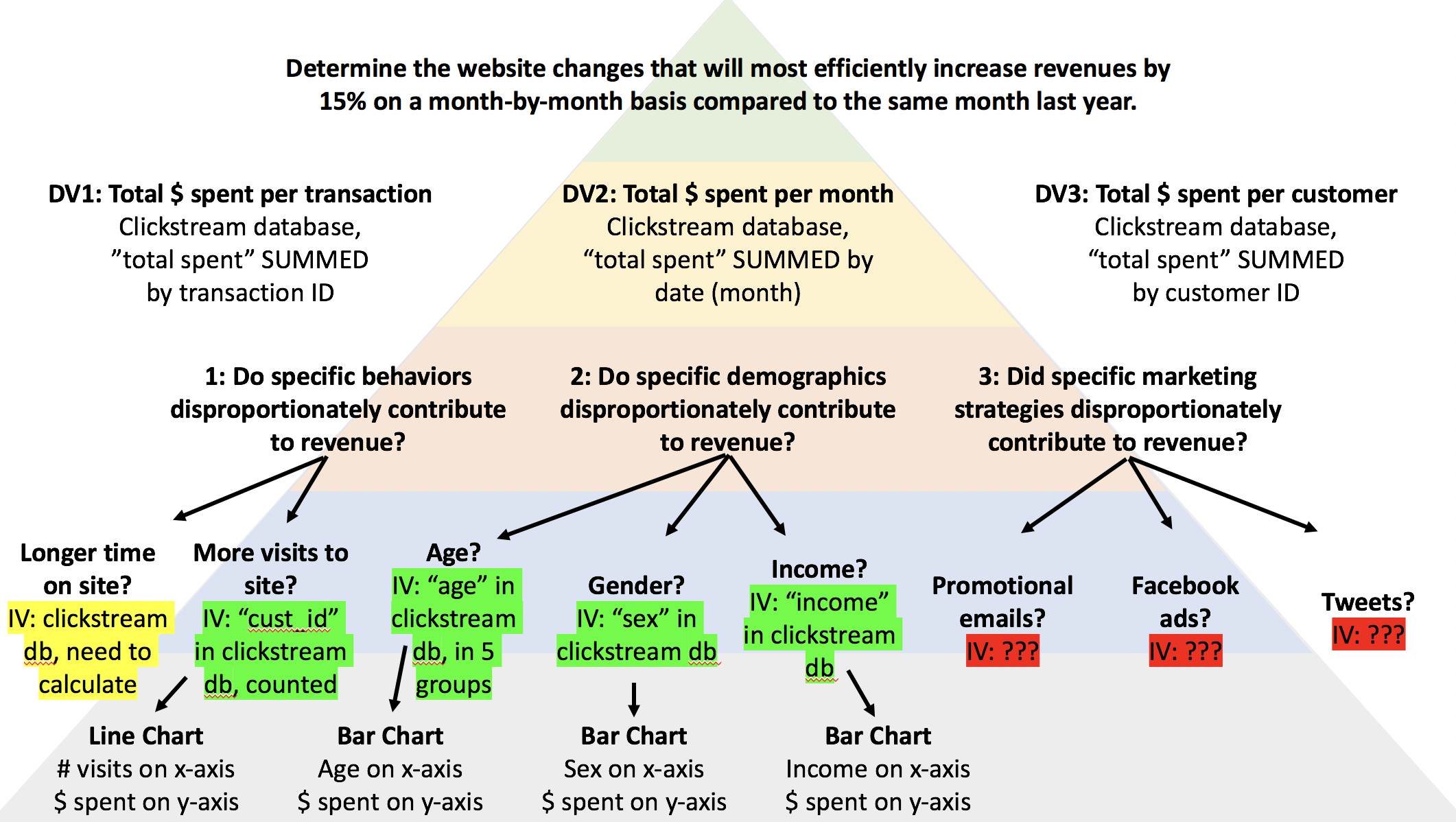
The first step of an analytics project is to distill the SMART goal into pertinent dependent variables. The SMART goal used in this worked example is the SMART goal developed in the previous post, namely, Determine the website changes that will most efficiently increase revenues by 15% on a month-by-month basis compared to the same month last year.
The SMART goal outlined above clearly pertains to revenue as a metric. What is less clear is how that parameter should be computed. In particular, the revenue could be computed for each transaction, for each month, or for each customer ID. Each of these ways of handling the revenue metric have different advantages and disadvantages. The best way to compute the revenue will likely depend upon the specific situation. At this stage, details are important, and there is no need to narrow the possible ways of computing the dependent variables.
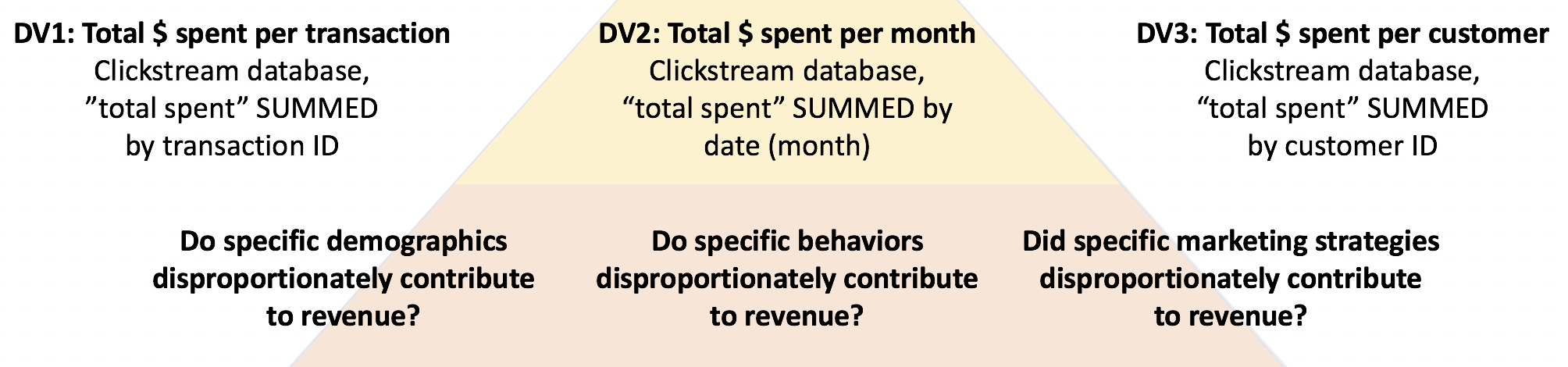
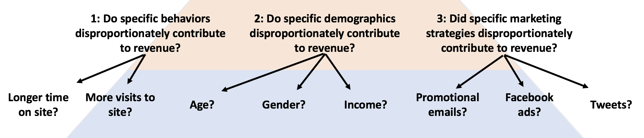
The next stage involves raising specific questions about possible interactions between the types of data. In this particular situation, imagine that three possible ways of construing the problem appeared important, based on conversations had during elicitation. In particular demographic effects, behavior on the site, and marketing strategies all were named as potentially relevant factors.
Next, the questions raised at the previous level are distilled into pertinent subcategory factors, in the form of descriptions of quantifiable independent variables.
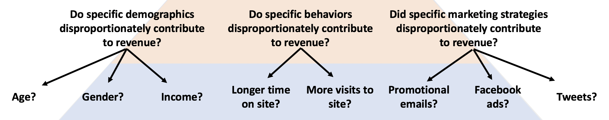
Depending upon the “breadth” of the sPAP (the amount of work it entails), it may be necessary at this point to rank-order the questions. This rank-ordering can be based upon the relative importance of their impact (based on intuition), their feasibility, or other relevant reasons. The most important effects can be placed on the left-hand side of the sPAP.
Note that at this point, the analysis is still being planned, not conducted.
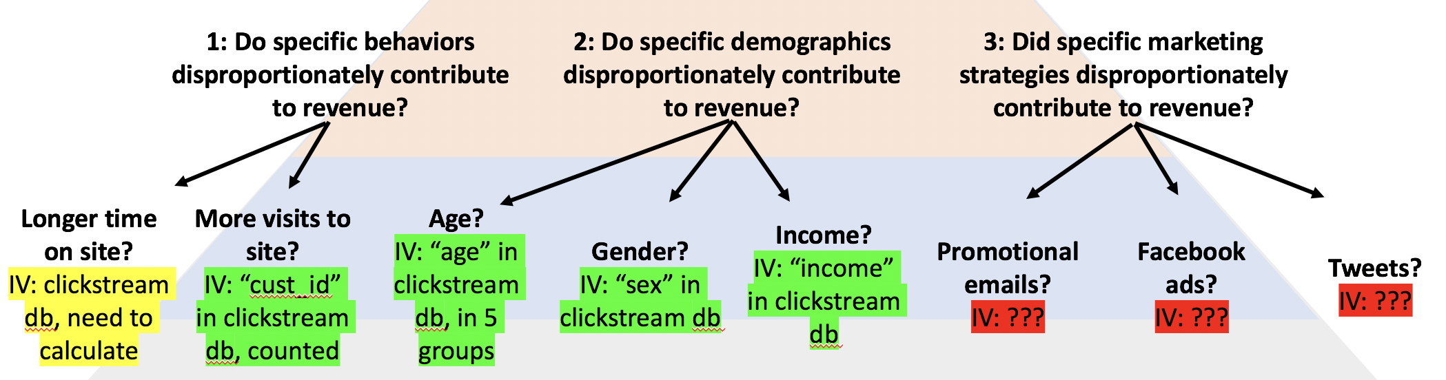
The next step forward is to convert the independent variables into prescribed pieces of data that can be extracted from a database, similar to the dependent variables. This means literally write down what piece of data to extract, and from which data source. Some of these variables may be easy to obtain, but some may require additional data collection or other steps. These can be color-coded, or otherwise identified, by the ease with which the data will be obtained.
In particular, Professor Borg suggests three categories:
- Green: you know where the data exists, and how to get it,
- Yellow: you think the data exists, but you’re not sure where or how the variables are organized, and
- Red: you have no idea if the data exists.
This is an important step, because although it may be easy to get some kind of data, it may be much harder to get exactly the data you want. It is best to figure out as quickly as possible whether or not there are critical data missing, or if there is data that will take a very long time to prepare.
Following this step, it may make sense to solicit feedback from all the important stakeholders. Ideally, everyone will support your path forward and the order in which you plan to conduct your work.
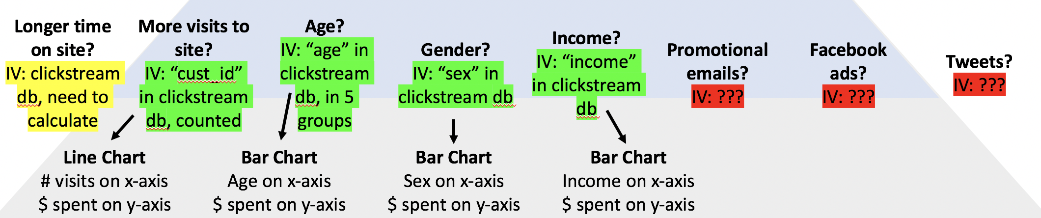
Finally, individual graphs and analyses can be listed in the bottom row. Once these specific graphs and analysis are generated, Tableau makes quick visualization very easy. If there appears to be a strong relationship, that particular analysis should be flagged for further, more in-depth analysis later on. The types of charts generated during this initial analysis should generally be limited to bar charts, scatter plots, and line charts.
Working through all the layers of an sPAP should be sufficient to help you identify all the most pertinent effects. That should be sufficient to enable you to make hypotheses about which business processes should be changed in order to achieve the S.M.A.R.T. goal.
Even if the results are inconclusive, the sPAP will provide good documentation of the analysis steps you have taken in support of achieving the SMART goal. This will help inform the next steps that should be taken in the ongoing process. This may include obtaining additional data.
The completed sPAP for this example follows.
Charts and analyses generated during this part of the project are for “analysis” purposes, not for visualization purposes. The former are generally less refined than the latter. Both types of plots will be discussed in other notes.